
One of the efforts I'm making as we head into 20201 is data consistency. I started looking at some of our key reports and noticed that as our maturity evolved, our reports evolved as well, but sometimes in a disjointed way. We'd discover a new technique in BIRT or better define a business process, which could alter one of our reports. As these alterations of our reports occurred, the reports across our environment wouldn't have a consistent feel because some reports may have been untouched. 2
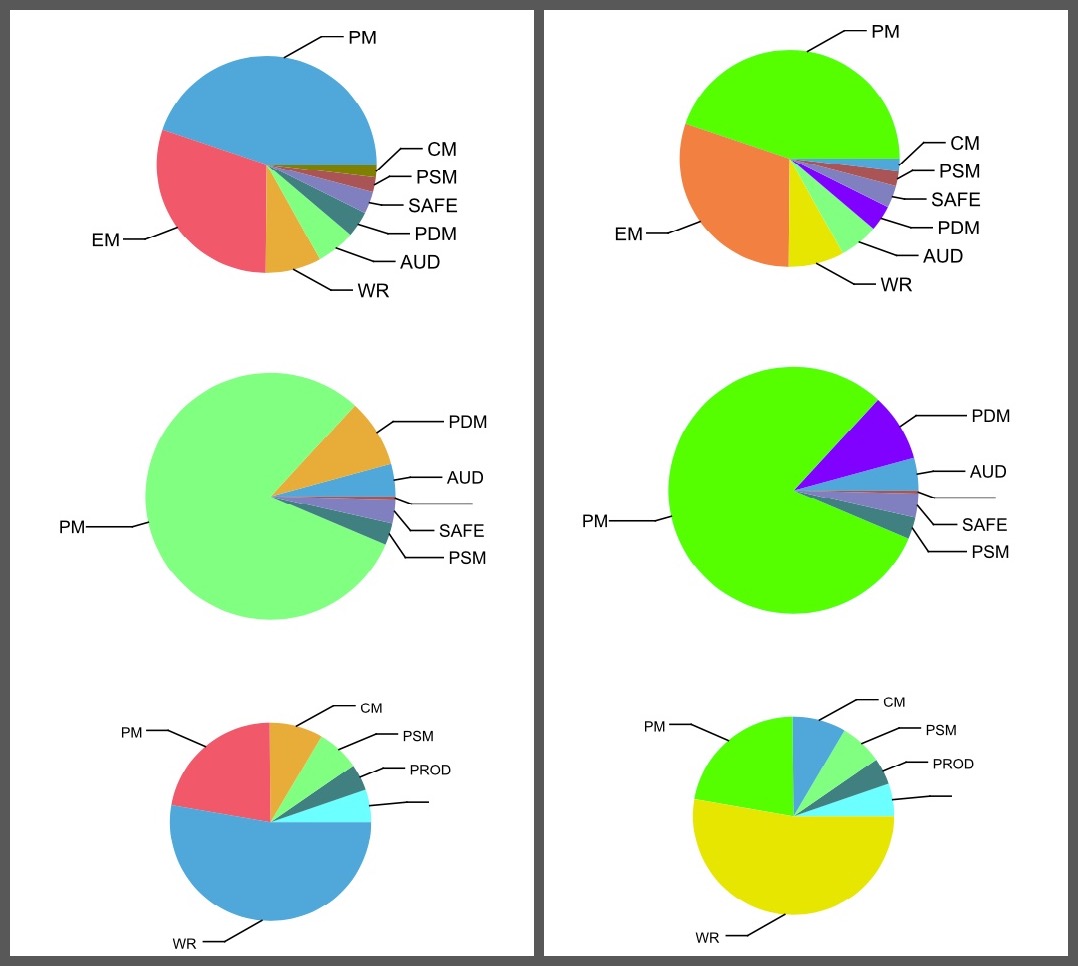
I'm working on an update to our reliability scorecard and I wanted to add some visual cues to what has been just a set of numerical charts for a long time. I got the data loaded for various views of our work orders onto 3 separate pie charts. The charts looked like this:
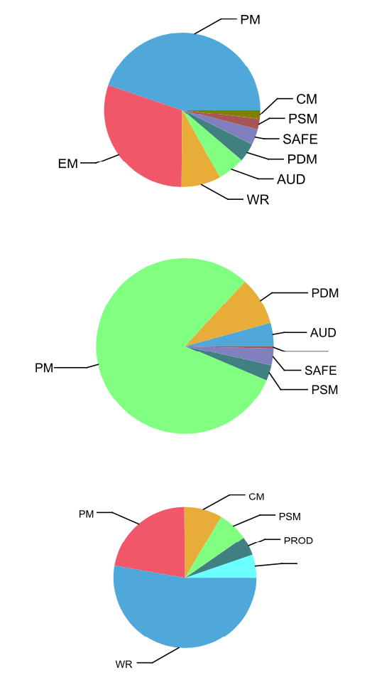
This was the correct visual representation of the data, but look at the charts closely... the colors change in each pic chart. That's not helpful when the goal was for a more consistent view.
Setting Chart Colors
I started digging through chart settings in BIRT and found nothing on how to set a chart color to the category value - e.g. worktype 'PM' will always be blue. I did some digging around and found a post similar to what I was looking for on the OpenText forums.
Hi, I'm using a multiple pie charts and the slices are colored based on what the value of the category series is. This is working as intended, but the question I have is can I specify the color based on the value of the category.
The steps to force a BIRT chart to specific colors turned out to be pretty simple. I identified the top 4-5 work order types I knew that would consistently show up in all the pie charts. The key to the process is creating a script to connect the Category values in the chart to a specific color palette.
Steps to Force Chart Colors
With the script created, I applied the script to each chart with the following steps:
- Create color palette for the Categories that will be shared across all the charts in BIRT. (Use the example script from above.)
- Open the BIRT report and select the chart you want to modify.
- With chart selected, click on the
Scriptbutton in the BIRT editor.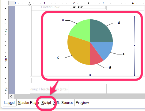
- This will open the
On Renderfunction for the chart, which is also the only function available.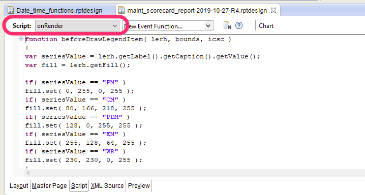
- Paste the categorization script you created.
- Go back to the
Layouttab and repeat steps for other charts. - Save the report file and preview the report.
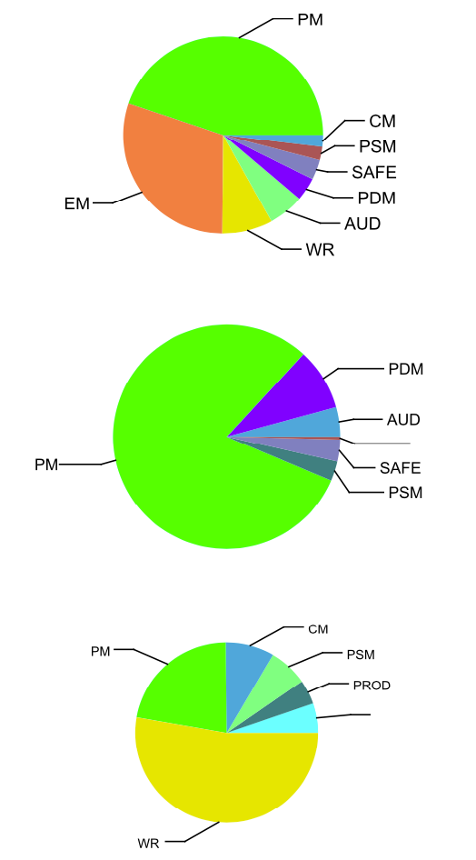
With the updated rendering scripts, all of the primary categories are now the same color:
Data Consistency
Doing a side by side comparison of the same dataset shows how the controlled version has more consistency between the category sets.
The next step I could take would be to set a standard for all work types, so no matter what the dataset is I would have consistent coloring on all the charts.